Overview
I designed and built this portfolio site to showcase my work in a clean, minimal way. I wanted the experience to be focused, fast, and distraction-free. This project includes everything from planning the structure to designing the UI and building it using a no-code tool.
I designed and built this portfolio site to showcase my work in a clean, minimal way. I wanted the experience to be focused, fast, and distraction-free. This project includes everything from planning the structure to designing the UI and building it using a no-code tool.
Problem
My work was previously hosted on Behance, which limited how I could present my projects. I had no control over layout, interactions, or structure. It also felt crowded and impersonal.
My work was previously hosted on Behance, which limited how I could present my projects. I had no control over layout, interactions, or structure. It also felt crowded and impersonal.

The goal
Create a personal portfolio site that:
• Gives me full control over layout and content
• Looks minimal and modern
• Is easy to maintain and update
• Reflects my skills in both design and no-code development
Create a personal portfolio site that:
• Gives me full control over layout and content
• Looks minimal and modern
• Is easy to maintain and update
• Reflects my skills in both design and no-code development
My process
Research
I start by researching similar websites and competitors. The goal is to find common patterns in layout, tone, structure, and interactivity. This helps identify what works and what can be improved.
I start by researching similar websites and competitors. The goal is to find common patterns in layout, tone, structure, and interactivity. This helps identify what works and what can be improved.
Portfolios
Portfolios
Notes/Learnings
Notes/Learnings
Clean layout, minimal copy, no distractions. Simple, beautiful, and focused—exactly the feel I aimed for.
Clean layout, minimal copy, no distractions. Simple, beautiful, and focused—exactly the feel I aimed for.
Loved the bigger typography, clean case study cards, and minimal navigation. Clear and easy to scan overall.
Loved the bigger typography, clean case study cards, and minimal navigation. Clear and easy to scan overall.
Great color use, strong visual style, and clean micro-interactions.
Great color use, strong visual style, and clean micro-interactions.
During my research, I explored many personal portfolio websites to understand how other designers structure their pages. I focused on things like section order, internal pages, CTAs, and overall layout. A few sites stood out for their simplicity, and strong visual style—qualities I aimed to reflect in my own design.
During my research, I explored many personal portfolio websites to understand how other designers structure their pages. I focused on things like section order, internal pages, CTAs, and overall layout. A few sites stood out for their simplicity, and strong visual style—qualities I aimed to reflect in my own design.
Mood board
I collect references from Pinterest, Behance, Dribbble, and — most importantly — real live websites. I find real websites more practical and insightful than stylized shots on Dribbble.
I collect references from Pinterest, Behance, Dribbble, and — most importantly — real live websites. I find real websites more practical and insightful than stylized shots on Dribbble.

Fonts & Colors
If the brand has no identity or needs a refresh, I choose fonts and colors from scratch. I prefer using Google Fonts because they’re easy to implement across web tools, and load quickly. Color choices are based on the brand tone and intended feel.
If the brand has no identity or needs a refresh, I choose fonts and colors from scratch. I prefer using Google Fonts because they’re easy to implement across web tools, and load quickly. Color choices are based on the brand tone and intended feel.

I chose Bricolage Grotesque as the sole typeface for this website. Unlike most widely-used fonts on Google Fonts, it has a unique character that adds personality without compromising readability. It feels modern yet slightly unconventional.
For the primary color, I picked orange (#FF5900). It’s bold, energetic, and immediately draws attention without feeling aggressive.
Design
I skip low-fidelity wireframes. I go straight to high-fidelity design. This helps me stay closer to the final product and move faster, avoiding unnecessary steps.
Inspired by how the Amie website transitioned from an artistic, style-heavy layout (Amie Art) to a much simpler and content-focused site, I aimed for clarity over flair. This mindset shaped the overall direction of my portfolio.


Consistent Element
A consistent visual element across the site is the 7-point star, introduced in the logo and reused throughout various sections. It acts as a subtle brand motif, helping tie everything together visually.
A consistent visual element across the site is the 7-point star, introduced in the logo and reused throughout various sections. It acts as a subtle brand motif, helping tie everything together visually.

Hero Section Evolution
I initially explored several hero section designs that leaned too much on visual effects. While they looked impressive, they distracted from the core message. I later simplified it to a minimal, clean layout that’s easier to read and understand.
I initially explored several hero section designs that leaned too much on visual effects. While they looked impressive, they distracted from the core message. I later simplified it to a minimal, clean layout that’s easier to read and understand.

V1: Too focused on visuals, message got lost.

V2: Highlighted my name (already in navbar), added two CTAs — felt redundant.

V3: Reduced text clutter, but bold background colors still distracted.

V4: Monochrome background with logo and CTAs as highlights — closer, but not quite.

V5: Removed background gradient for full focus on heading, tried an 80s vibe but lacked originality.

Final: The stars aligned — clean, focused, and finally feels right.
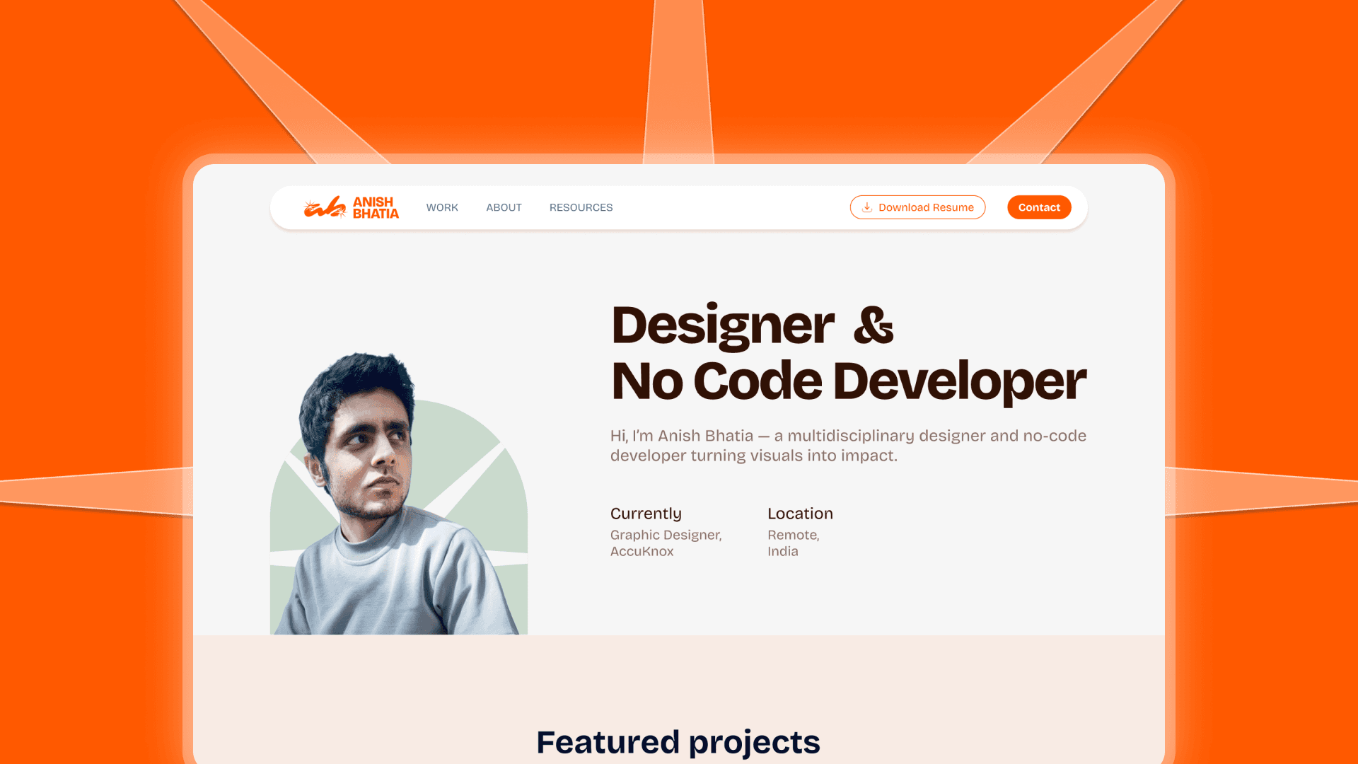
First Fold Focus
In the first fold, I kept just two CTAs: a low-emphasis “Download Resume” and a high-emphasis “Contact” button. This keeps the focus clear without overwhelming the user.
In the first fold, I kept just two CTAs: a low-emphasis “Download Resume” and a high-emphasis “Contact” button. This keeps the focus clear without overwhelming the user.

Headshot Direction
The hero also features a headshot of me looking toward the main headline. This small UX decision is intentional — people tend to follow gaze direction, which helps guide attention to the key message.
The hero also features a headshot of me looking toward the main headline. This small UX decision is intentional — people tend to follow gaze direction, which helps guide attention to the key message.

Development
Once the design is ready, I build the site using Framer. It lets me match the design 1:1, add interactions, and ensure a responsive, fast-loading experience.
Once the design is ready, I build the site using Framer. It lets me match the design 1:1, add interactions, and ensure a responsive, fast-loading experience.
Next Steps & Learnings
• Add real-world client case studies instead of just self-initiated projects
• Expand the site with more pages and sections over time
• Improve speed and accessibility further
• Explore dark mode or alternate themes
• Learn more about automating CMS workflows
• Add real-world client case studies instead of just self-initiated projects
• Expand the site with more pages and sections over time
• Improve speed and accessibility further
• Explore dark mode or alternate themes
• Learn more about automating CMS workflows
Need Design or Just a Fresh Perspective?
I work on digital design, UI, and no-code builds. If that’s what you need, let’s talk.
I work on digital design, UI, and no-code builds. If that’s what you need, let’s talk.
I work on digital design, UI, and no-code builds. If that’s what you need, let’s talk.
